project scope.
The Lancaster Symphony Orchestra has played for nearly four decades and their core purpose is to enrich, entertain and educate the South-Central Pennsylvania community through unique live musical performances and to provide community engagement opportunities for students of all ages.
The LSO is engaging, building, and strengthening our community through imaginative and unique musical experiences.
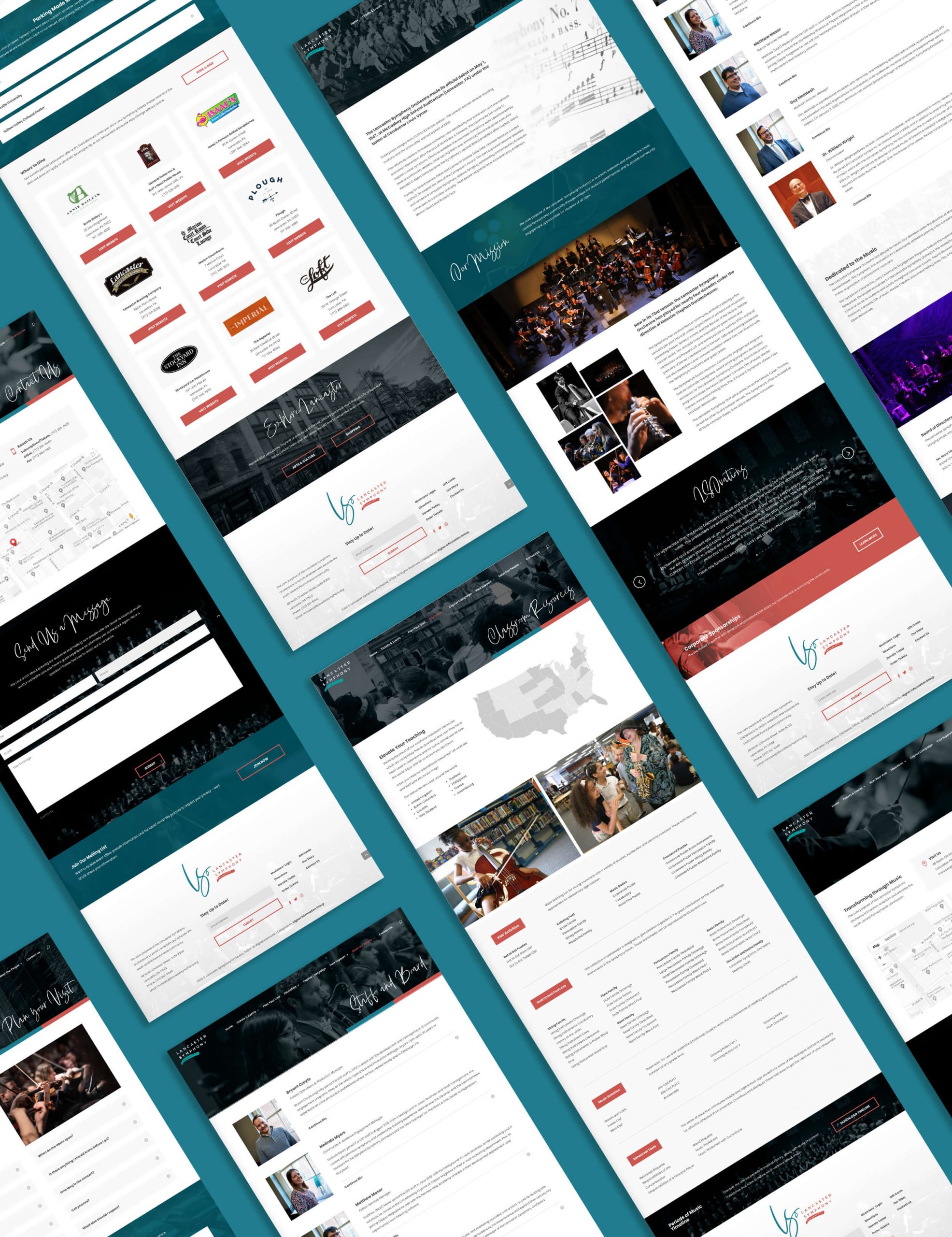
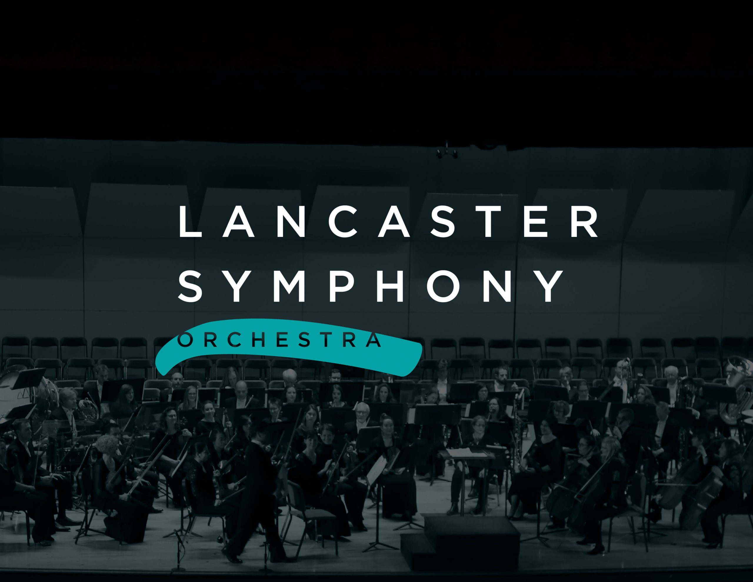
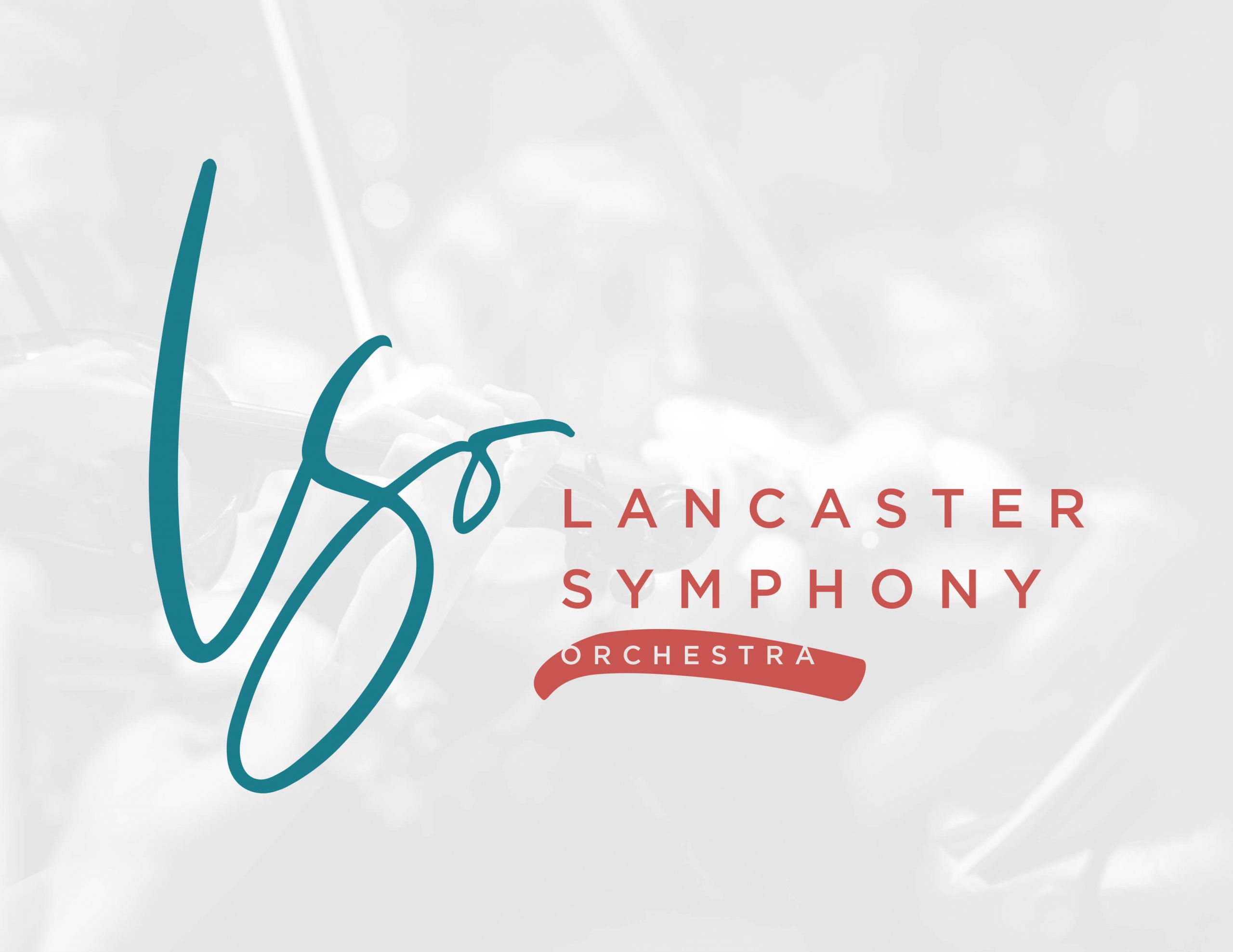
The LSO underwent an extensive rebranding process from logo design to website. I created a unified identity that has set them apart from the other orchestras in the area. Their new logo is representative of a free spiritedness through the fluid logomark, and the brushstroke integrated into their main logo. Their color palette is a mixture of teal, salmon, and black.
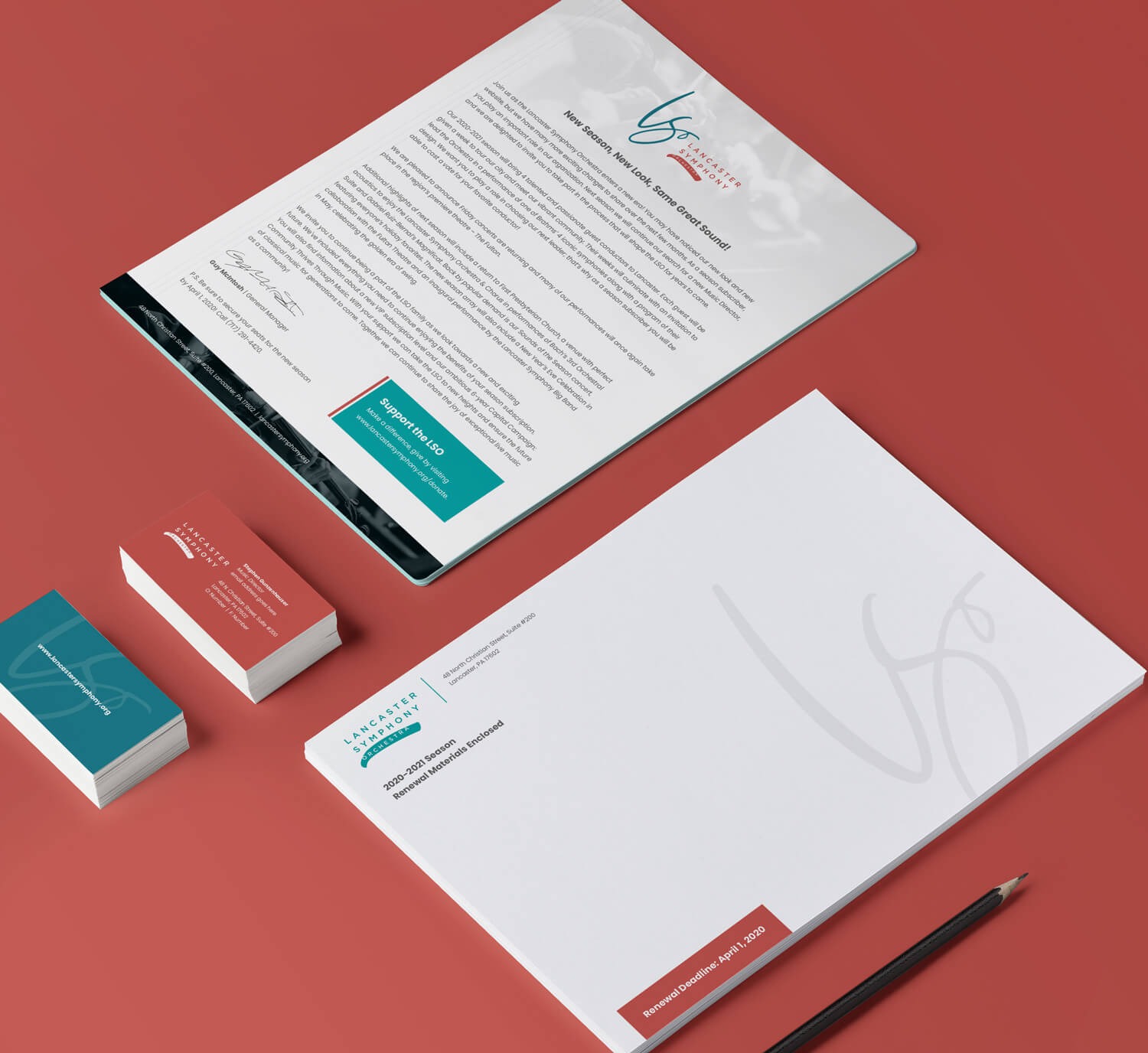
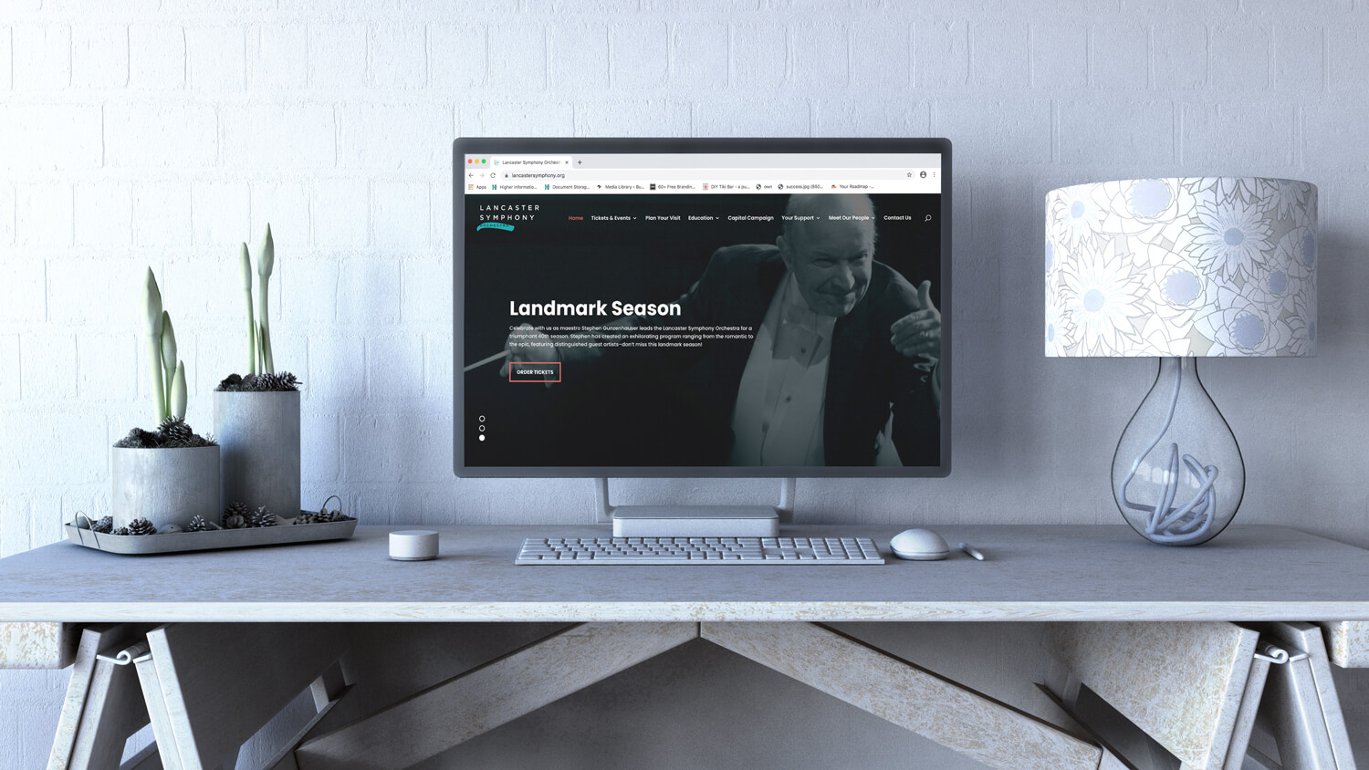
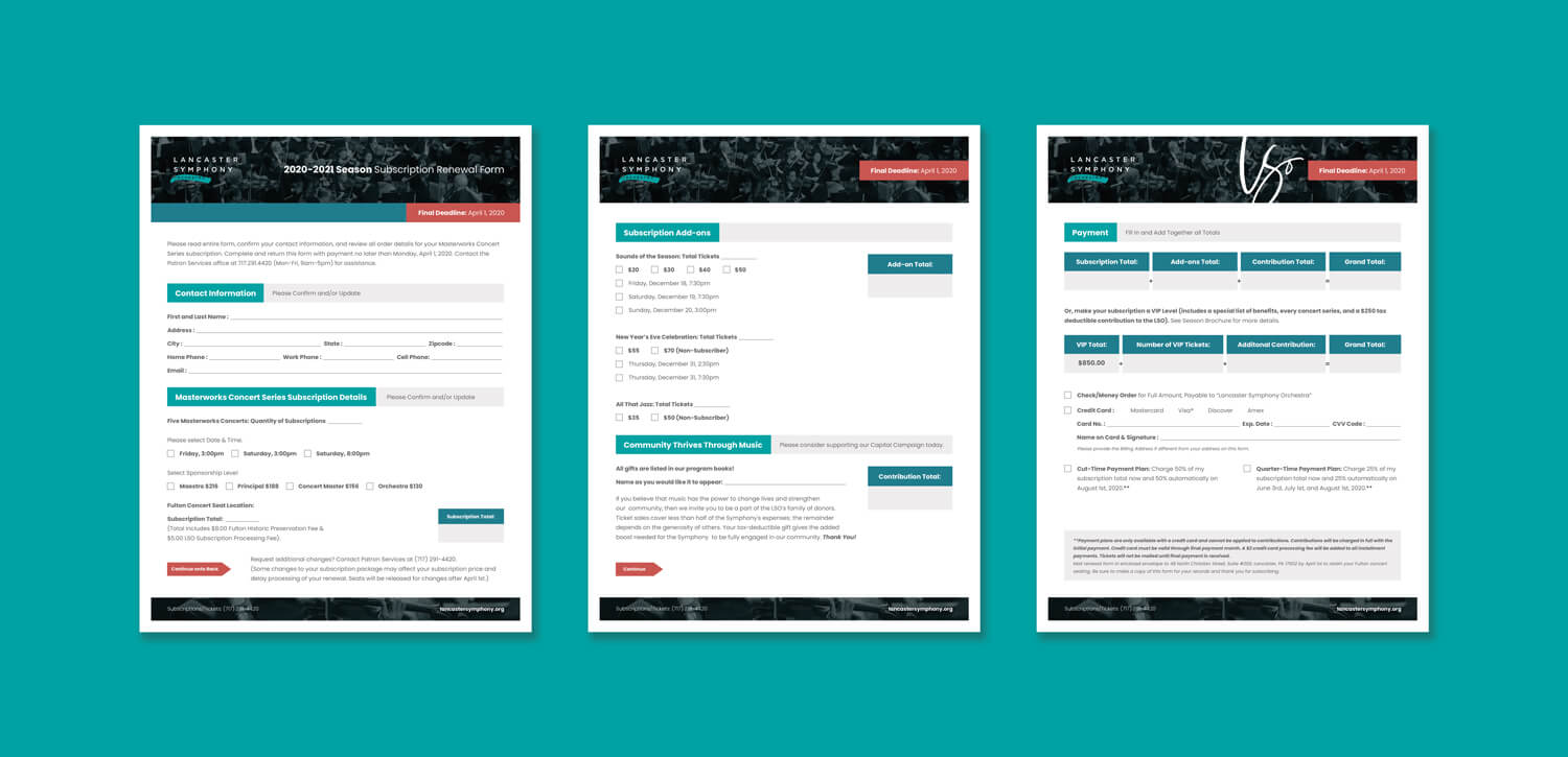
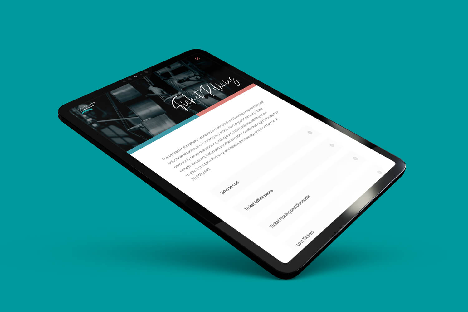
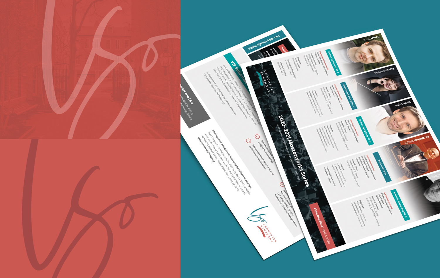
Upon completion of the logo redesign, I established and identity package to match that included letterhead, business cards, envelopes, and a subscription renewal package. There are cross connections between the subscription renewal package and the website: a degree of playfulness with splashes of salmon. Throughout their new website, I relied more heavily on imagery that they provided. This established a sense of true identity as they did not rely on stock imagery. The overlay was used strategically to have those images contribute to the layout versus compete. Finally, the cursive font was intertwined throughout the website to form a counterbalance to the logotype and add a degree of wonder.
details.
Branding, Logo Redesign, Identity Package, Print Design, Web Design, WordPress, Divi, Mobile Responsiveness, CSS Customization.


let's make some magic.
I genuinely love collaborating with new clients to bring to life their visions. Share your project details with me if you are interested in creating magic together and we can get started on your next big idea.
