project scope.
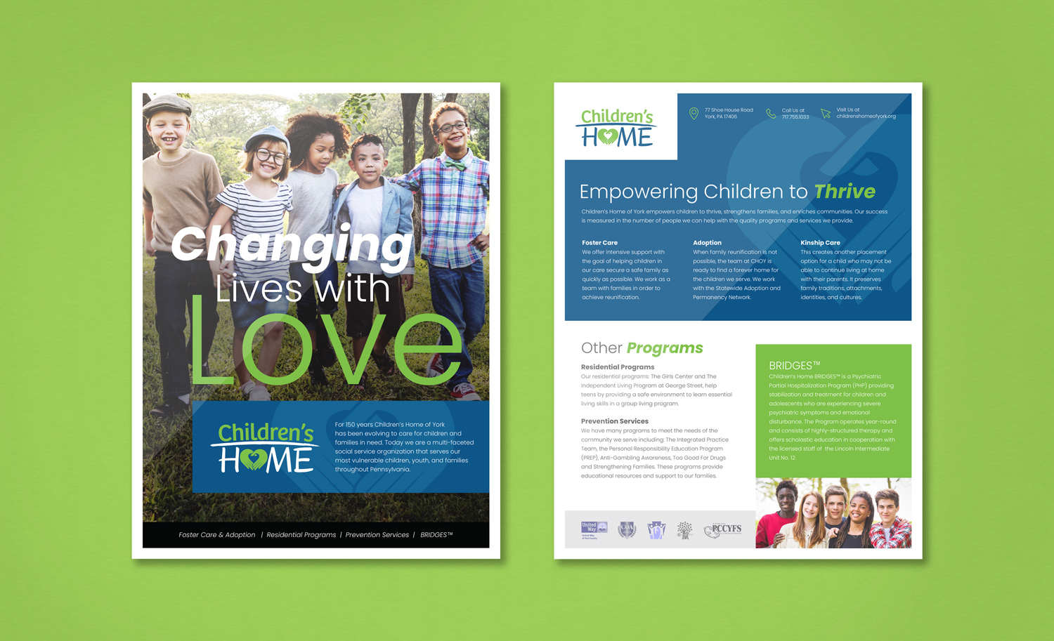
Children’s Home of York empowers children to thrive, strengthens families, and enriches communities. For 150 years, they have been evolving to care for children and families in need.
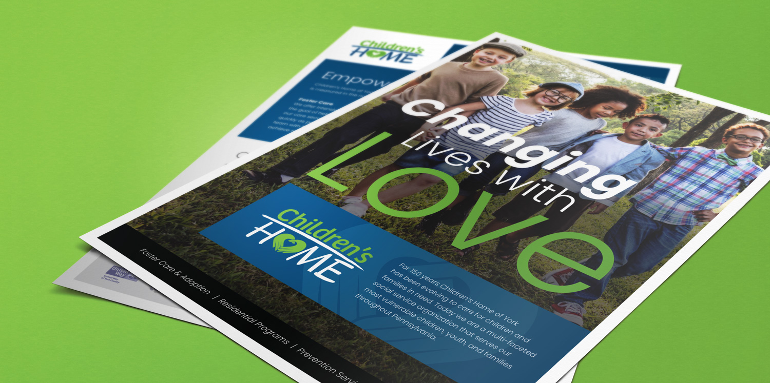
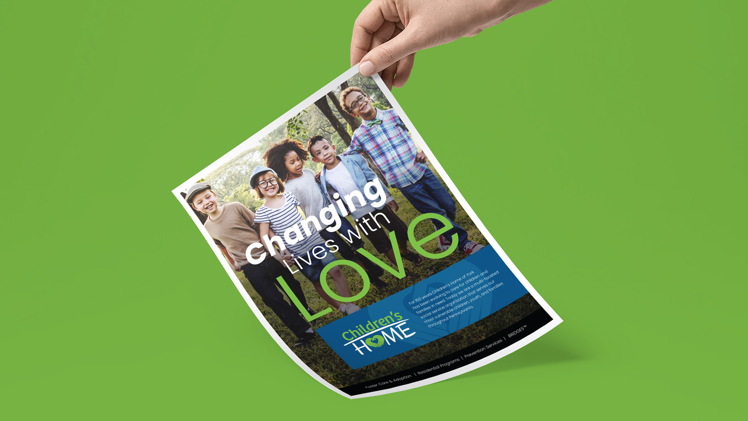
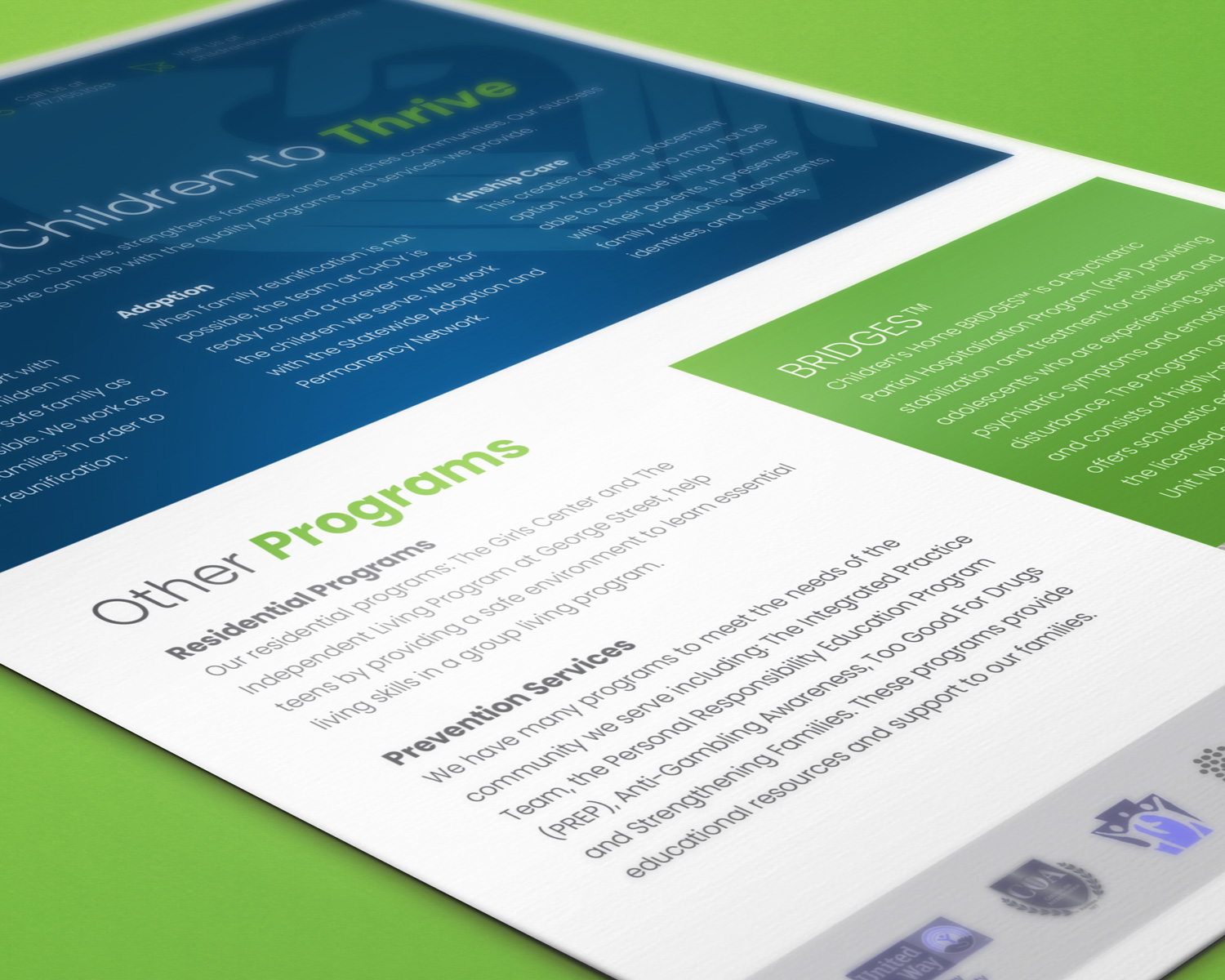
I designed a double-sided flyer to promote the programs of CHOY in a coherent and easily consumed layout. This was composed to truly embody their mission through typographic choices, content structure, and through the familiarity of their brand colors. The fonts are contrasting to convey the message of diversity which is also reinforced through the imagery. Their logomark is used as a background element to further communicate the love and safety that their programs offer.
details.
Flyer Design, Print Design.


let's make some magic.
I genuinely love collaborating with new clients to bring to life their visions. Share your project details with me if you are interested in creating magic together and we can get started on your next big idea.
